Summary of my year
I have learned an amazing amount this year. I set myself the challenge of pushing my boundaries, and to go past my comfort zone, to explore things i knew nothing about. A combination of working with people who i really like working with, and the fact that we set ourself a really challenging project from the outset, meant that there was a great potential for me to really enjoy myself whilst creating something i can be proud of. I am very happy that our project turned out the way it did, and i knew it would from the fact that the people who were working on the project were so dedicated to it from the start. I definitely feel that i have benefited from this year immensely, and have learned an awesome amount about all sorts of things. I feel i have gained good knowledge in Lighting, and i aim to continue exploring this area in future projects. I also feel i have become better at modelling and texturing. Putting into comparison the skills i had at the beginning of the third year, to the skills i now have at the end of the third year, i have been filled with confidence for the future, in any which way i choose to pursue.
Rendering
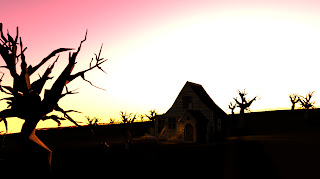
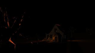
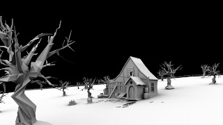
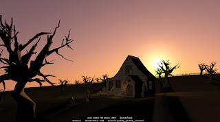
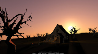
Ive been using my Shot1 as a test to test out some render layers, i decided to render out a diffuse pass, a beauty pass and an ambient occlusion pass, i also rendered out the master layer, and then took it into Photoshop and had a play around with the multiply settings to see what happened. In all honesty i didnt really know what i was doing, however i managed to get an improvement on the original that i rendered out. The bottom picture in the list is the composite, you can see that it has a more natural highlight,which is especially noticeable on the tree in the foreground compared to the image above it which is the original without passes.
Here is a great tutorial i used to learn about render passes. Its in 2 parts, however this is part 1.
http://www.pixelcg.com/blog/?p=924


Here is a great tutorial i used to learn about render passes. Its in 2 parts, however this is part 1.
http://www.pixelcg.com/blog/?p=924
Dynamics
Diogo was supposed to be creating a shatter effect on our ink pot, however he got stuck because of his buggy version of Maya, so i offered to help him now that all my lighting is done. I managed to create the shatter after watching a great tutorial online. The dynamics really got on my nerves, because they are so buggy, and you really have to take care that your whole mesh is spotless, and cleaned up with all the history deleted for the shatter effect to even have a chance of working. Anyway, i managed to get it working on the ink pot, and ive given it back to Dieogo, so that he can use it in his animation, instead of the sphere he was using. That way he can add his previous gravity fields to this new shatter pot, so that its the same as before, only with the new improved pot :)
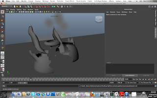
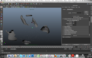
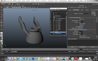
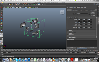
i used a cloud particle emitter and linked them to push the polygons in a way that looked like an explosion. If you look at the videos below youll see a little fun test i did with green smoke bellowing out of the pot as it explodes. I just did it as a test to show Diogo.
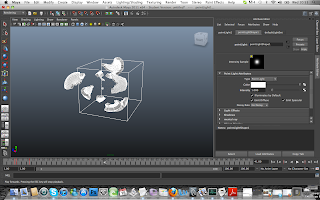
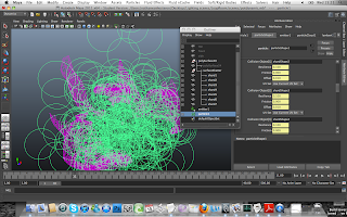


i used a cloud particle emitter and linked them to push the polygons in a way that looked like an explosion. If you look at the videos below youll see a little fun test i did with green smoke bellowing out of the pot as it explodes. I just did it as a test to show Diogo.


Some animation
I wanted to do some animation for the project, and soem for my personal self as a test. I hadnt done any character animation since the first year of university so i wanted to keep it short. I wanted to test with a moom rig a similar shot to what Alex was animating for the film. One of my favourite hots in the film, is when the librarian puts her pen down and yawns, so in turn i have tried a yawn pose with moom.
I have also done an animation of a rig i made of a curtain. The rig is very simple, consisting of four bones i moved individually to get a nice fluid movement, you can see the videos below.
I am happy with the outcome of the curtain as i feel it looks pretty natural in its flowing movement.
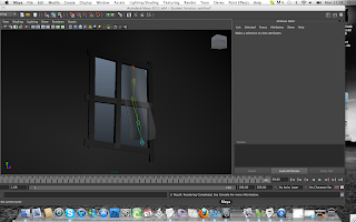

I have also done an animation of a rig i made of a curtain. The rig is very simple, consisting of four bones i moved individually to get a nice fluid movement, you can see the videos below.
I am happy with the outcome of the curtain as i feel it looks pretty natural in its flowing movement.


Update 6 days to go
Have been focusing on getting the shots ready for rendering, now that the animation is completely finished. Only 6 days left to go, and the renders dont look like they will be done in time for submission, however we are keeping our hopes up that the problems with the render farm get fixed in time for the degree show!
RENDER!!!
Its about time to render now, weve got about 8 days left till submission and a week after that, and weve been doing some tests, however we havent been able to start rendering yet. We had a meeting with Alex Hulse, who went through render passes with us, and were def going to need to use this info when we start to render, i for one need to render the leaf in shots 1-2 in a separate layer, so the light dont effect it as much because it becomes somewhat invisible in the shadow. Ive also been reading up on ambient occlusion and other render layers that you can use, and what they do. Me Depa and Alex Bax will be going through each shot shortly to make sure its ready for rendering :D exciting times...
Leaf animation (Process)
There is a variation of different play blasts here from my experimentation with the three animation shots. This first block out i did to establish the timing of the leaf falling.
The second playblast i added some rotation of the leaf, however i was not happy with it.
The third playblast i tweaked the rotation a little to make it a little mre realistic, however i am still not happy with it.
This playblast was to block out camera timing for shot 2.
I then added the leaf, however from the time it comes through the window, to out of shot, is too short.
i added some rotation to the leaf.
I changed the direction from where the leaf enters the window.
I slowed the animation down, however the leaf now takes too long to go off screen at the end.
Gettng there...
My first 3 shots
Shot 1
The camera will start at a distance from the house, positioned on the right hand side of the screen. The camera will then pan in slowly on a curve towards to window on the top floor of the house. All the time this is going on, a leaf is gently floating from the top of the screen, into view, and meets the camera at the window, where it gently floats through.
Shot2
Shot two is from inside the house, the camera is positioned on the top floor of the house, to the back/right of the lectern facing the window. The camera will slowly zoom towards the top edge of the bible on the lectern, whilst exaggerating the main focus, that being the leaf that has floated through the window, and past the bible, out of shot.
Shot3
Shot three is an aerial view of the bible, the camera zooms into a passage in the bible, where it then holds its pose for a second or two.
Animation... My role in it...
With regards to animation, i have agreed to do shots 1-3, where the leaf flies through the sky, floating gently through the window, past the book and then out of shot, where the camera then cuts to a zoom into a passage from the bible.
I feel i am capable of achieving this, and will set about doing some animation tests, and test play blasts, and then amending any mistakes i can see.
I will also take to some secondary/prop animation, in the form of a blowing curtain in the wind, as well as the hands of the grandfather clock.
I feel i am capable of achieving this, and will set about doing some animation tests, and test play blasts, and then amending any mistakes i can see.
I will also take to some secondary/prop animation, in the form of a blowing curtain in the wind, as well as the hands of the grandfather clock.
Outside the window?
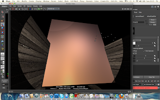
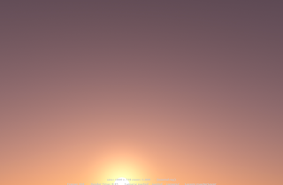
In our shots, we have a few that we can see the outside in, so i needed to come up with a way of showing the outside (sky) in these shots. After some trial and error, using a S&S system, i opted not to use it, because it effected everything in the scene, and there was no way to block it off so that just a horizon showed up without effecting the lighting we had already done on the inside of the building. I chose a more sensible approach of creating an image plane, and applying a texture that you can see below to it. I then evenly lit it with a light, and placed it appropriately in the scene, to give the simulated effect that the building had an outside to it.


Shot by Shot finished lights
Taking Depa's candle and implimenting into my lights
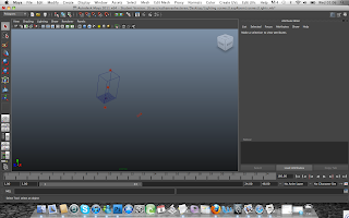
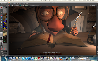
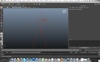
The next stage in the process of interior lighting, was getting together with Depa at university, and taking her candle from her and importing it into each of the light sets that i had created which required it. The candle was made up from an emitter, three point lights and a directional light, which all had different light intensities to simulate the glow of a candle. Depa did not manage to get the candle to flicker, however this is one of our main focuses to ensure we get the flicker sorted out for the degree show.
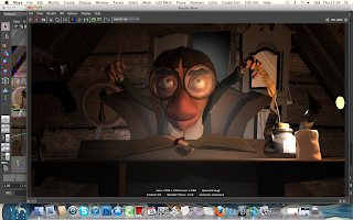
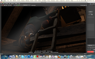
The candle she gave me gave my scenes a good edge to them, they gave a lovely glow to the edges of objects within the scene, and caused nice reflections on things such as the grandfather clock face. This layer of light has definitly improved the shots as a whole.
Below are some screen shots of her candle's lights, and also some shots where her candle has been used along side my lights to give the scene an extra edge to it.


Adding fog systems for effect
I did this a little earlier in the process, before adding coloured lights, however i forgot to mention it and thought it was important so came back to it.
These are a series of images showing how i added fog particles into the scene, and the difference they made to the scene. The fog acts as a ray of light coming from the window behind, once the texture for the sky has been put in place.
I created the fog using a volume primitive and using 'CubeFog', changing the scale of the cube, and the density of the fog to suit the specific shot.


Lighting the Exterior
Here is my Exterior lighting, this post shows how i reached my final exterior lighting, i will explain at each point.
The image below is the light set i used to create the final render.

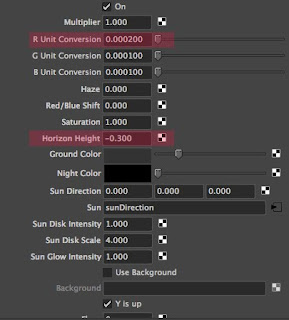
This image below are the settings i used to create the pink haze in the Maya Sun and Sky system.
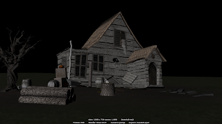
This first image shows my render with default lighting being used. The textures look very flat, even with a bump map on, the scene at the moment seems to have no life to it.
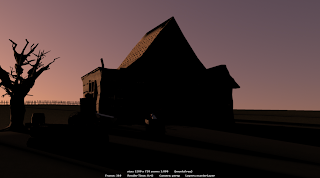
I created a S&S system with the settings above, and change the sun direction to horizontal, i have the sun facing towards the back of the house, meaning the front of the house is in harsh shadow, giving the illusion of dusk.
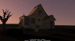
The next step was creating a spotlight, with a colour attached to it, similar to the pinky colour of the sky. I raised the drop-off of the light to make the light less harsh, and it gave a nice even finish to the front surface of the house, without making it too bright.
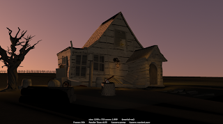
I was happy with the image above, however, i decided to add some more lights, emitting from a lamp attached to the front wall of the house, i gave them a orange glow, created by spotlights, i also created lights emitting from inside the windows of the house, around the side of the house, spilling out on to the ground. Overall i am very happy with the finished lights.
The image below is the light set i used to create the final render.

This image below are the settings i used to create the pink haze in the Maya Sun and Sky system.

This first image shows my render with default lighting being used. The textures look very flat, even with a bump map on, the scene at the moment seems to have no life to it.

I created a S&S system with the settings above, and change the sun direction to horizontal, i have the sun facing towards the back of the house, meaning the front of the house is in harsh shadow, giving the illusion of dusk.

The next step was creating a spotlight, with a colour attached to it, similar to the pinky colour of the sky. I raised the drop-off of the light to make the light less harsh, and it gave a nice even finish to the front surface of the house, without making it too bright.

I was happy with the image above, however, i decided to add some more lights, emitting from a lamp attached to the front wall of the house, i gave them a orange glow, created by spotlights, i also created lights emitting from inside the windows of the house, around the side of the house, spilling out on to the ground. Overall i am very happy with the finished lights.

Subscribe to:
Comments (Atom)


